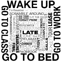
 This is my first rough. I decided to use my schedule monday-thursday. I do four things everyday and thats wake up, go to class, go to work and go to bed. I used those to frame different things that happen on different days depending on my schedule. I used Helvetica because of the amount of options. As far as the composition goes I consider my organization style as organized chaos. Nothing is really in a rigid place and I group things together in certain ways. However at the same time I'm a bit OCD (strange combo I know) so I felt like there had to be some sort of structure because mostly my days have a basic frame (the 4 bolded events) and then a bit of chaos inside (the different sizes, strokes etc for the various events). This is my favorite.
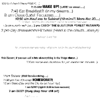
 This is my second rough. I basically wrote down everything I wanted to do first then I included either my thoughts on that task or what really happens. As I mentioned before I have "organized chaos". I grouped all the campus events at the top and the late night events I tried to keep them closer to mimic how after 11, everything rolls by quickly vs the afternoon with all the space. I used Helvetica because it had more options to choose from however I finished this on my home comp and I didn't have all options so I plan to switch up sizes and selections at the lab. I'm having trouble trying to figure out how to place everything inside the square so any help would be REALLY appreciated!
I can't remember what else I need to talk about sooo I'll leave it at this. :)
On your first rough I really like how you organized all the words with the major category they go into. I like the different styles of Helvetica you used and I think they work well together. I like the almost down spiral effect it has been given as well.
ReplyDeleteThis one is also my favorite of your two.
On your second one I like the idea of space, I’m also using that element in my own project. It is kind of tricky to get, but if you want to show 11pm on, going by quickly, try to put all the text kind of stacked on top of each other… the lines of text very close, kind of overlaid on each other. As for setting up all the text in the box, try to start at the left and go horizontally. I’m not sure exactly how that would look, but just keep trying different things, because right now it really has no structure. Good luck over the break!
I like the structure of your first rough. The capital letters make it work, too. It starts getting hard to read, though. If you want the readers to read it all the way through than work with the text size more. If not, its good the way it is. Maybe keep exploring ways to read more flowingly. When I see the outside bold words, that is all I want to read. Work with the thoughts inside the bold letters.
ReplyDeleteFor the second one, I like it. You should put more movie quotes in parenthesis like you did for the “run forest run.” Make it more alive and exciting. Maybe change the way its read from left to right. (work with orientation and lettersize) Keep the spirit of humor in this composition. Maybe change the sentences in the middle to darker grayscales as it is a little hard to read. Nice work!
When I first saw the top rough, I wasn’t quite compelled by it. It just seemed like someone crammed a whole bunch of things between huge words. But then I read your story and it’s exactly what you intended. Organized chaos is a perfect way to describe it. So after reading your input, I’ve become quite fond of it. Other people may not have the chance to get that side of the story, so you may want to tweak it so that anyone can interpret it without background information needed.
ReplyDeleteIn the second one, I really like the light-hearted sense of humor. I respond to it more than the first because of that. I’m sure there may be a better design solution in there somewhere, but I can’t quite figure it out. I can’t quite tell from the image, but is that a super thin font in the middle or is it gray? If it’s gray, Rose will yell at you because that’s a no-no. If it’s a thin font, then you’re good to go.
I’m torn to which one I should suggest you choose as your final. I feel like if you work on the second one, it will be better. But at this stage, the first one is better. Good work so far!
First rough: I like how you enclose all your other activities inside “WAKE UP, GO TO Class, Go TO WORk, GO TO Bed” because that is what you have to work around, and this is where time management comes into play. Good use of the bolds, with thinner fonts sizes. I like how you made the more important activities or duties in bold, making the more important activities stand out compared to the things that can be put off for a little bit. I feel it gives an optical illusion of going deeper and deeper, I suggest you make the center words look smaller, giving the illusion of it going farther and farther into an unknown tunnel of chaos.
ReplyDeleteThe second rough, doesn’t appeal to me in any way because I feel as though I have already seen this concept a couple of times now. I really like your first composition. It works!
I like the way your day is essentially “boxed in.” The first rough is nicely layed out and in the end; it results in being more appealing to look at as opposed to your second rough. The second one may be too structured. I like how the second one fits together like a puzzle. Its like your day consists of a lot of things, but in the end it makes up one day like a puzzle. I too agree that I’ve seen the second one done before as well. I appreciate all the varying weights of each word, so that was a good choice of font. I like how you drug out certain words such as “run,” “focus,” “sleep,” etc. Again I like the focus of Wake up, go to class, go to work, and go to sleep. I squinted my eyes to see the varying weights of the words, and actually that made me like this composition that much more. It reminds me of a traffic jam or something like that. I like this solution better.
ReplyDeleteI think the first one is a great idea. I like how you explained your grid like form of what four things you do everyday then inside is all the options and craziness through out your day. The composition really exemplifies that and I understand the image. I also like how “late” is in the middle of the image, it shows how everything is hectic during the day. It is interesting to read all the words inside the square, most of them people can relate to and make you giggle like “people watch.”
ReplyDeleteI found myself giggling again when I read this. I like all the side notes after everything you do during the day. It gives it personality and is definitely interesting and fun to read. I do think I like the first one better as a composition. This one is fun, but is missing something maybe the fact that there is nothing going on from 3 to 7. But otherwise I think they are both great!
Work on the first one more. Frame up the edges of the outside so that there are no gaps in the corners. I like the font variations inside it gives a sense of depth and a vortex into the center.
ReplyDelete