Friday, October 29, 2010

Whisenhunt - Poster with type grid layout


I found this poster while surfing around and thought I would post it as an example of a design (with illustrations and type) similar to our last project. This is from the 2008 Shakespeare in the Park (Central Park, Manhattan) season. Not opera, but close...

Tuesday, October 26, 2010

Price Grid system

Snider - Modular


Whisenhunt - Grids


TheSpaceRace-poster


This poster uses an Axial layout with most of the type to the Left of the line.

design: dániel perlaky for cityonfire.us

The Space Race special event at The Parish, Austin, TX

Ordaz-Modular


Paula Scher, 1980

Morgan-Axial


McClain - Grid System

The theatrical poster for Social Network is a great example of the axial structure.

The poster was designed by Kellerhouse, Inc. They've done theatrical posters for other movies like The Informant, The Art of the Steal and Gomorra.

Original - http://imgur.com/SYweU.jpg
Overlay - http://imgur.com/tKhiX.jpg

Talley- Dilatational


This poster was created by Domenic Lippa for issue 15 of circular magazine. It is a dilatational system.

Hogan-Bilateral


This poster is an example of a Bilateral system, you can see each sentence is centered on an axis. It was designed by the company Ignition Print in 2008 for Fox 200-Studio's movie, 27 Dresses.


Sandoval—Bilateral/Axial Grid System


In Radiohead's In Rainbows album art, the text extends across the width of the cover with varied spacing of the letters on each line. This cover is similar to the example in Typographic Systems on page 149. One could make the case, however that it's an axial layout like the next example.


In this cover for Disc 2 of the album, you can see that the lines end before the far right edge, which suggests that there is an axis on the far left.

Designer: Dan Rickwood AKA Stanley Donwood — 2007


Cole-Transitional Grid System


This poster utilizes the transitional grid system. The text is aligned in horizontal, merging registries. The type hierarchy is in the standard top-to-bottom format, but it is not boring . It works to complement the intense diagonals and movement created by the dancer's body.
Designer:Paula Scher
Year:2008
Client:New York City Ballet
Design Firm:Pentagram

Monday, October 25, 2010

La Tomatina


This is a poster for a huge tomato fight that happens every year in spain.
The designer (unknown) used a transitional gird and radial grid to make this design.

Childress - The Women


Art Director: Mario Ventenilla
Year: 2008
Grid: Bilateral


Grid

I hate and love these. I hate it because its a boring. I love it because it has potential to becoming alot more cooler.

Simchick - Grids


Transitional grid

Design Firm: Modern Dog
Designer: Michael Strassburger
Client: House of Blues
Year: 2006
Screenprint, 18" x 26"

Wilson - Bilateral


Bilateral grid

Advertising Agency: Saatchi & Saatchi, Budapest, Hungary
Creative Directors: Attila Lonkay, László Nagy
Art Director: Petra Kocsis
Copywriter: Zsófia Oláh
Published: October 2010

Melton-Grids


This is a poster design for a production of A Streetcar Named Desire by Ryan Wenner. It was done this year and Ryan solved the problems of this design using a modular/grid type design. He usually designs websites for large companies like the vs clothing company and Wells Fargo.

Gonzales-Transitional


Nike Ad-Empowering Women. "My Butt is Big" campaign. 2005
Ad Agency: Wieden+Kennedy

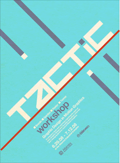
Suniga-Axial Grid


Poster for Altamira's Tactic Event.
Motion graphics panel and discussion workshop.
by Network Osaka,
a freelance graphic designer,
he has been in many publications and
 won many awards for his designs.
Visit his website here NetworkOsaka!


James- Grid System


I randomly found this online and I looked everywhere for the designer's name, but I couldn't find it. I'm pretty sure it's a free lance designer who made it and put it on flickr. There were a couple of other posters with variations, all using the grid system.

Tyler - Grid


This is a poster ad for Kitchen Dog Theater in Dallas, TX, utilizing a grid structure.

Rob Wilson, creative director
Mark Perkins, principal
Michael Langley, writer
Kelly Allen/Brett Baridon/David Braddock/Chuck Johnson/Rob Wilson, illustrators
Brian Bevolo/Sandy White, production artists
SullivanPerkins, design firm
Kitchen Dog Theater, client

Rice-Bilateral Grid System


An drunk driving ad from a Romanian ad company in the casualtyofdesign.com July 2009 archive.

Advertising Agency: Mercury 360, Bucharest, Romania
Art Director: Ionut Rusu
Copywriter: Alexandru Malaescu
Creative Group Director: Liviu Turcanu

Claypool - Grid System : Grid


This is one of three ads part of the Foot Locker's 2010 "Class Is In Session" campaign intendedly geared towards children during the back-to-school season.

Agency: Sapient

Designers:
Brien Swann
Garland Lyn
Nathan Avila
Brad Blondes

Design Director:
John Kunichika

Creative Director:
Todd Feitlin


king-grids


Monday, May 04, 2009 10:50 AM
Artist Jeff Prosise
Radial

Barron-TRANSITIONAL


Artist: Paul Bass
Year: 1957

Davis-Grid System


The artwork I chose was produced by ".disorden". He has no affiliation to a design firm and the date was no where to be found.

Albiter - Bilateral


mojo-posters-cross-rgb.jpg

This poster is from a series of six posters that poke fun at cliches from Publicis Mojo in Sydney. The type is laid out using a bilateral grid system; the text is organized symmetrically on a single axis down the middle of the poster. Micah Walker initiated this series in 2009.
"Mojo creative director Micah Walker tells us the poster project, entitled Words To Work By, is the first of a series of self-initiated projects that will see the agency link up and work with various different artists and designers..."
"'The set of six posters, are designed as resolutions, and poke fun at some of the clichés we all come across in the industry,' explains Walker. 'They’re a limited edition print run of 100, some as lithographs and some as screen prints. We sent them out to friends, clients and colleagues, as a crafted hello more than anything else. Luca Ionescu, from Like Minded Studio, worked closely with us to bring the lines to life in a way that felt appropriate and fresh. It's all just part of us trying to keep a constant spirit of creative productivity. It's nice to not only do ads all the time,' he adds."
The other posters in the series can be seen at the URL below:
http://www.creativereview.co.uk/cr-blog/2009/april/words-to-work-by-poster-project