Saturday, January 30, 2010

Brimer, Bromley Communications


This is the lettermark for the leading hispanic ad agency Bromley Communications. Bromley has headquarters in San Antonio and offices in Los Angeles, New York and Miami. Ernesto Bromley wrote his thesis about acculturation in college and his research led to the development of Bromley Communications and his ideas helped harbor their success. This lettermark makes me remember "Bromley!" because it is bold and it looks like it could be some sort of important stamp. I also like that the "C" harbors the "B". It is a good solution to getting the company's name remembered.

Friday, January 29, 2010

Larson- Big Black Logo


I choose the 'Big Black' Lettermark...
You have probably seen this logo around on shirts to shoes to hats or on MTV on "Rob and Big". The character Big (aka Chris Boykin) is the CEO of Big Black Inc. and of Double B Enterprises. Ok- the designer. I have looked and looked and I can not find an actual designer of this lettermark! I have looked on all his websites and googled everything, but still have yet to find it. However, obviously this lettermark was and is a simple and quite successful idea.

Webber - JG Wentworth


You may recognize this logo from those lawyer commercials that air during afternoon talk shows. JG Wentworth is a law firm that specializes in helping people get lumps sums of money from their structured settlements and annuities. The commericals claim that they can help anyone get their money fast. I like how the W's seem to go from smallest to biggest and then crisscross each creating create a maze.
I not find who designed the logo.

Lettermark project 1 example


This is logo for Artemis Records an independent record label company i believe based in New York, their logo was designed by Micah Nolte. Choose the design particularly for its object replacement concept, and this would be closest to what i want to accomplish with this first project.

MARCUM- CNN Logo


The Cable News Network was founded in 1980 and is available in over 93 million U.S. households. It is impressive to me that the two "N's" bleed together but are still read correctly. I was unable to find who designed the logo.


GODWIN; Mother and child logo

Mother & Child logo

Mother & Child was a logo for a magazine that has never been published. It was designed by Herb Lubalin and Tom Carnase in 1965.
This is such a clever lettermark and done well before the PC or Adobe anything! When i think of lettermarks, this always comes to mind.

Martinez-Dedicated Micros Inc.

Dedicated Micros Inc. is an international market leader in the field of specialist CCTV control video surveillance equipment. They are the leading manufacturer of CCTV solutions for security applications from mega pixel IP cameras, to high performance, high definition recording transmissions and decoding systems

I could not find who the designer of the lettermark logo was, I could only find Integrated Solutions Partners of Dedicated Micros Inc.

Brown - Associative Economics


Associative economics is based on the idea that economic life is the responsibility of every human being in collaboration with humanity as a whole. It proceeds from what we think and do, rather than by way of abstract forces. Associative economics is about making this responsibility conscious and finding ways to give it effect in practical life.

On 29 September 1998, a Quality Guarantee Mark (see above) was established to promote an associative approach to modern economic life by raising awareness of the economics not only of one's own enterprise but also of the wider environment in which it is embedded. Association in this sense enhances the functioning and reputation of any enterprise using the Mark, at the same time as it furthers an associative approach to economic life more generally.

Registered in Switzerland and internationally, the Mark is the property of the Associative Economics Association, founded in England and registered in Switzerland.

Thursday, January 28, 2010

SIMMONS- Window on Women | Logo for Internet based community


An excellent example of project 1, this lettermark/logo was designed by Czech designer Jan Sabach who practices graphic design in Brooklyn, NY.

Window for Women is an Internet based community about issues for Australian women.

http://www.krop.com/jansabach/

GARCIA Michael Heck Dentistry


Here is a great vintage logo from the 70's for Michael Heck Dentistry in San Francisco. It was designed by Alan Mazzetti and Howard York, the latter who has done identity work for Taco Bell, Sanyo and Jack in the Box. The "M" and "H" merge together to form the shape of teeth, with the ascender of the "H" forming what could be seen as floss. A nice touch of creativity for a clean, simple logo.

Salas Green People

Green People is a company that specializes in organic body care products.

Belcher - OP logo

Fred Ryan and Edmond Shumpert started Ocean Pacific in 1969 as a surfboard brand. Shumpert created the name Ocean Pacific and designed the logo for their company. They set up a surfboard shop in California and produced some 'short boards' that sold well. In 1972 Jim Jenks wanted to design clothing for surfers off and on the beach, he created the Ocean Pacific apparel line. The company is currently owned by Iconix Brand Group. Their 35 year anniversary was in 2008 and an ad campaign featuring some famous names was launched to celebrate it. In september 2009 OP launched its own music blog which is on their website.

OLESEN Polloni Design logo

Polloni Design is a graphic design company in Raleigh, North Carolina. It was begun in 1994 by Alberto Polloni as a sole proprietorship, and later incorporated the company as a NC corporate entity in 1996. Alberto's sister, Clina Polloni joined with Alberto in 1998 when the company began to grow and added her talents of branding, marketing, and website design. Staring off with the goal of creating corporate graphic identity services in North Carolina, it has now expanded its services worldwide. In addition, since they are both fluent in Spanish, the company offers bilingual copywriting services to their clients.

Karissa Cardoza - GUCCI


Gucci is the biggest-selling Italian brand in the world. The Gucci logo with the interlocked double ‘G’ was designed by Aldo Gucci after his father Gucci Gucci’s initials in the late 1960’s. It has been the official logo for this label after that.

Wednesday, January 27, 2010

Maria - NASA

National Aeronautics and Space Administration
This logo type called the 'worm' was used from 1975 until 1992 when it was retired for a modern version. Although it is still brought out to use for promoting NASA via merchandising. Some people prefer this compared to the latest version which is done in "meatball" type.
NASA is an independent agency of the United States government responsible for aviation and space flight. It was first formed on July 29, 1958 and it's Motto is "For the Benefit of All"
Things to be looking forward to:
Possible retirement of the Space Shuttle this year and replaced by Orion 2015
Completion of the International Space Station (ISS) in 2011 this is also "the most expensive object ever constructed" estimated between 35 billion - 160 billion
Man returns to the Moon by 2018 to "setup outposts as a testbed and potential resource for future missions."
All it really means is that you should start buying up Real Estate for the Moon now!


Wilson - GE

Forbes ranked GE, aka General Electric, the largest company in the world in 2009. It was formed in 1892 when Thomas Edison's company, Edison General Electric merged with a company called Thomson- Houston Company.

GE's logo was designed about 100 years ago, and was originally just a tag for the first electric fans. Minimal changes have been made to the logo since it was first designed, however GE went through branding changes in 2004. GE created a corporate color palette, the slogan was updated to "imagination at work", and they even customized their own font called GE inspira. Wolff Olins made slight modifications to the logo at this time, incorporating the new color palette.

Serrano-Mendoza LG Electronics

The LG Electronics is a Korean company which focuses on many electronics such as phones, T.V.s, and even chemicals. The L and G in the the logo creates a face. Their slogan is "Life's good."

EMBREY Elle Hive

Gesch- DC Shoes Inc.


Ken Block, who started out screen-printing T-shirts in 1989, created DC Shoes. DC Shoes was introduced to the public in 1994 as an extreme sports shoe for skateboarding, snowboarding, skiing, surfing, BMX, and motocross. Centered in California, DC stands for “Droors (drawers) Clothing Company. Beyond shoes, DC distributes a multitude of apparel and accessories for men and women. DC Shoes became notorious amongst professional skateboarders such as Danny Way, Colin McKay, and is currently the sponsor of professional skateboarder and MTV reality star Rob Dyrdek (Rob and Big).


I chose DC Shoes because it is the first that came into my mind. Mainly because I love these shoes. I have multiple pairs and they have the cutest styles. They are also comfy and warm as a winter shoe. I like to wear skate shoes not because I skate, but because I like the style. I do work out in them because they match my crazy work out clothes. Overall, the logo is genius and appealing with it's bold simplicity. The asterisk is a nice touch.


Tuesday, January 26, 2010

Babson, Stumble Upon


I am not really sure who designed the stumbleupon's logo, but if I knew I would for sure say. Stumbleupon is a site where one can discover the good, the bad, and the ugly of websites and you can give a thumbs up (literaly) to sites you like.

I chose the Chanel logo, created by fashion designer Coco Chanel in 1925. The logos simple design has held up for quite a long time without change or question of quality, and her fashion design has followed suit. Interesting that one speaks to the other. Coco Chanel made the little black dress famous, as well as Chanel #5 parfume and the list goes on to hand bags and shoes. Classic and casual merged in her designs.

SWITZER, Play Station Logo

The PlayStation logo was created by Manabu Sakamoto, who also created the logo for Sony's VAIO computer products. I feel it's just really solid, and represents that the playstation is a 3d game console. tI have always liked this lettermark, ever since I first got my playstation and Spyro the Dragon for my 12th birthday.

To 12 year old me, this was the symbol for fun.

EA Sports - Lettermark


The Electronic Arts logo has undergone few changes in the company's history. EA's classic Square/Circle/Triangle corporate logo, adopted shortly after its founding and phased out in 1999, was devised by Barry Deutsch of Steinhilber Deutsch and Gard design firm.

I chose this lettermark because I used to play the games as a kid and the design is very bold and it draws the viewer into the game and makes them curious.

Perry- Associated Press


The associated press is an American News Agency. The logo is present on all news articles that come from the Associated press. I bet most people have seen these on many news articles seen on FOX News websites, and CNN. I think this letter mark looks a lot like the project we are working on now by the way the letters merge together. I like the way the two letters look like one image, but are deistically two letters.

Cook-Bay Area Fellowship


This is the logo for my church Bay Area Fellowship. Lynae Hilton is the graphic designer that came up with this solution for this "media-driven" church. Bay Area Fellowship is one of the fastest growing churches in South Texas and continues to expand. There are now 6 campuses, the furthest from the original in Corpus Christi is the San Marcos branch.


Lebron James Logo

lb23.gif

Lebrons trademark symbol for his clothing line with nike. He has his own shoes, clothes, basketball accesseries and even his own basketball. In the logo u can find his initials LB and his number 23 along with his notorious crown for his nickname king james.

Hartfield Volkswagen


I chose the Volkswagen logo because the logo was actually designed by one of the engineers who designed the engine for the Volkswagen. He was awarded 100 reichmarks for winning the office competition. Franz Xaver Reimpiess was a pretty interesting guy. He created several different types of engines, brakes and a independent wheel system. He has patents on several inventions for Volkswagen and Porsche.
Volkswagen was created in the late 30's because the average German couldn't afford the luxury cars that flooded the market. Hitler called for a "people's car" that the average German family could afford. Long story short, Volkswagen was born. Another interesting fact is all of the major French, British and American (Ford!) motor companies were offered the Volkswagen's factory but all of them said no. They thought the project would fail and in Ford's case, found the car "not worth a damn". In November 2009 Porsche and Volkswagen (which includes Bugatti, Audi, Bentley and Lamborghini among others) overtook Toyota to become the world's largest manufacturing group in terms of production. Not worth a damn says Ford? Time is ironic.

Lee - DUB

Not a strong lettermark but it still works. DUB is a magazine, founded in 2000, that covers urban custom cars and celebrities. It is something similar to MTV's Cribs but just about custom vehicles. They also launch the DUB Magazine Custom Auto Show & Concert and sell many licensed goods.

Thomas - Branding Projects Monogram

This is the monogram for Ben Pieratt's design shop named Branding Projects. I love it because, at first glance (and without knowing who designed it), I figured it was a Paul Rand logo; it resembles his Yale logo quite a bit (seen here). Otherwise, I love thin fonts with interesting characteristics like this.

Dix - Lettermark


I chose this one because when I first read the books back in middle school I remember being impressed by the way all the letters were combined in a legible yet foreign looking way. This is the monogram/logo for J R R Tolkien and the Tolkien Estate. the Tolkien Estate controls the copy write on all of J R R Tolkien's work. I can't find a designer for the logo anywhere, it wouldn't surprise me if J R R Tolkien created it himself. I will update this post when I find more information.

alan.carolino

Master Plan Music Group by Youngha Park
Accompanied description:
"Master Plan is a hip-hop music production company. The Client aimed to a modern look for the company identity through the use of some old school elements. The initials 'M' & 'P' of Master Plan are combined to visualize a retro stainless steel microphone. It also shapes a fist which symbolizes the power of hip-hop music..."


I stumbled upon this logo & was immediately drawn towards the clarity & simplicity of the design. After reading the description, though, I began to analyze & interpret the image in different ways. I absolutely love how different interpretations can be made by minimally altering the angle of these two letters.

Monday, January 25, 2010

Lettermark


The MTV logo/lettermark was designed by Fred Seibert and Frank Olinsky. They designed it for the music channel on tv. Nowadays it plays its own shows and not so much music.

Ryan Considine

I've always found the USA television network logo to be awesome. It is ingenious yet obvious. A great use of negative space too. I was unable to identify the designer.
Click to see the whole thing...

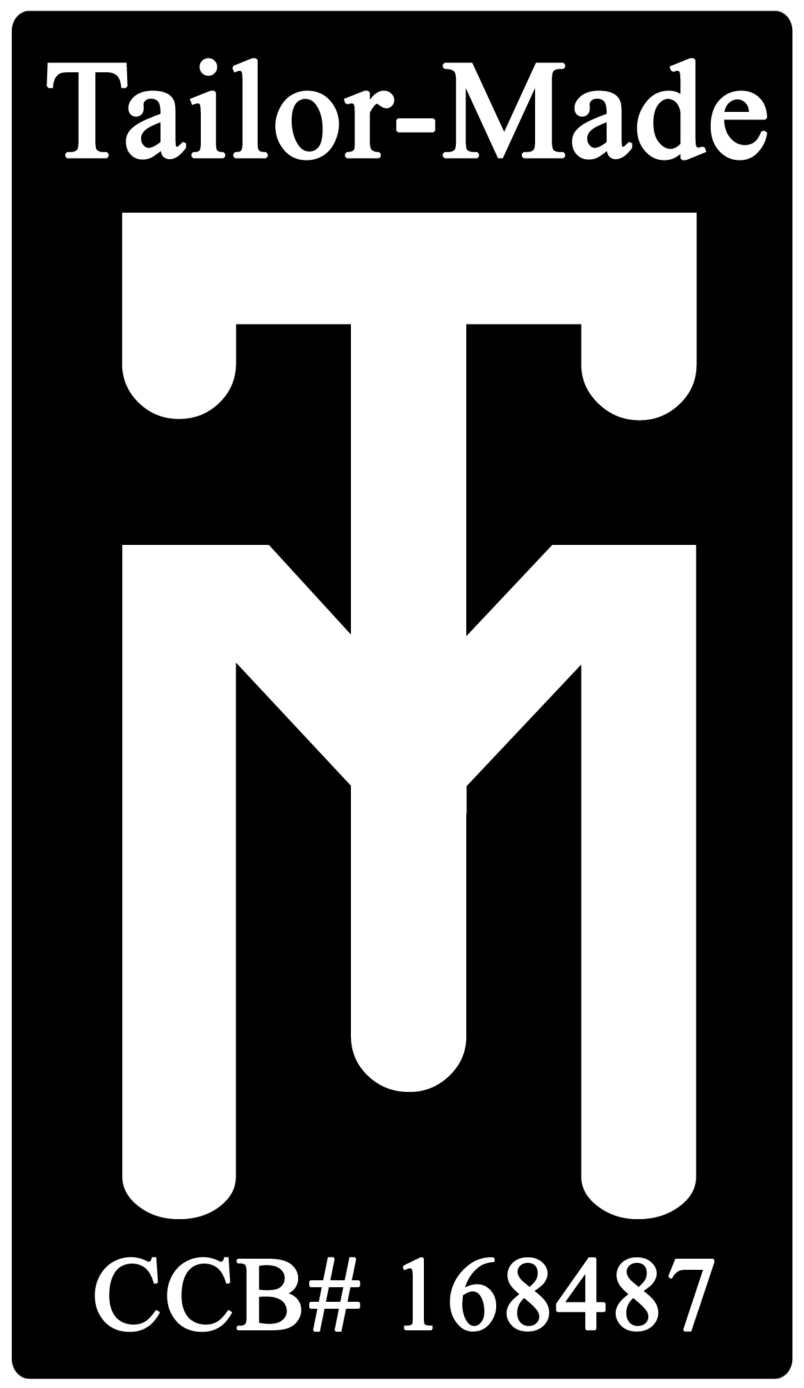
Tailor made


This is the logo for the company Tailor-Made. I'm not sure who designed the logo, but this is really close to our lettermark project. The company produces custom tile.

marasigan - angleton first


This is a lettermark (and title) designed for the church I used to go to. Pretty sure it was designed by the youth pastor, Ryan Manes. Not sure what font was used either.

Blog Assignment #2: Lettermark example

Blog Assignment #2: Lettermark example
Find a lettermark, similar to what we are doing in project 1, and post it up. I suggest you look on branding and corporate id websites. Give credit to the designer and give us some info on the company it was created for.

Put your last name on the Title bar so that it is easy to find you and the company of the lettermark. Ex. NEWTON Tiger Woods logo. In order to keep things organized, please add the label "lettermark" and your class time "8am" "11am" or "2pm" at the bottom of your post in the bar. IMPORTANT: Place commas between labels!!!

DEADLINE for post 5pm Friday, January 29.
Note: all blog assignments will be given by Tues class and will be due by Friday afternoon. Missing deadline will result in no credit for post.