Friday, September 17, 2010

Meet Your Type: A Field Guide to Typography

Hi guys,

This is an interactive book called "Meet Your Type." All components of it can be downloaded together or separately as PDFs:


Enjoy!

Thursday, September 16, 2010

Snider K2 Ski

I chose K2 ski's logo... I really enjoy how they used aspects of the top of the Kto begin the top arch of the two.

Claypool - IBM

I chose the IBM logo designed by famous American graphic designer, Paul Rand best known for his corporate logos. The stripes give the logo a dynamic feel rather than static and heavy giving it visual interest while keeping it simple.

Fausnacht - Portland Chamber Orchestra


Portland Chamber Orchestra logo, obviously. The perfect circle and thinness of the c and o remind me of one of my favorite fonts, century gothic(one of the things that made me jump on this logo). The juxtaposition of the super bold p in with the super thing c and o create a playful duality for me and I enjoy going back and forth and around the whole circular c shape.

Letter Logos

The K C in this logo represents the Kansas City Royals. The reason i choose this logo is becasue of how they sat the C on the Leg on the K

Sandoval–Cupanion

http://www.reusablecups.com/htmls/cupanion.html

So, I was looking around on LogoPond and came across this design. I thought it was pretty neat, yes? U and the P make a mug! They offer an eco-friendly alternative to the very common disposable cups you see in coffee houses and such.

Hogan- Gucci


The Gucci Logo was designed in the 1960's. The logo's double G's- One facing forward and the other backwards-represent the initials of the designer, Guccio Gucci. I picked this logo because of it's strong simplistic design. In reading through the history of Gucci I found it fascinating that it is still as renown today as it was in the 60's.

Albiter - Techni-Mold Engineering Inc.


Techni-Mold Engineering Inc. uses this logo. I think it is an interesting way to use negative space to create the impression of an "M". It is simple and gets the job done.

Wednesday, September 15, 2010

Acosta Christopher, merging letters, typography


I choose this particular image due to how its use of negative and positive space interacted with one another. Even though this image does spell the word typography in an asymmetrically form, i was still able to read and see every letter in the composition.

Quiroga - CNN


CNN's logo is probably one that I see everyday, and I think it's an effective one.

The logo was designed by Anthony Guy Bost in 1980. It was designed within 48 hours because it wasn't realized that a logo was needed until the very last minute before the company got off the ground. Since budget was a factor in choosing a logo, it was created using only one color.

CNN stands for Cable News Network, which matches the logo perfectly; Terry McGirk, who was then VP of Turner Broadcasting but also involved in CNN's start, said, "They gave us 4 or 5 different looks, and one sort of stood out, a cable running through the letters C-N-N," (source). The logo hasn't been changed in 30 years, which makes this logo both effective and timeless.

Wilson - Lotus

I picked the Lotus logo because it includes merging of letters that to most people wouldn't seem to go with the name of the car company, so they just seem like a nice design element for the logo. The letters, ACBC, stand for Anthony Colin Bruce Chapman. Chapman was a automotive designer, builder, and the man who founded Lotus Cars.
Morgan - E2 Consulting


I chose this one from E2 Consulting. It's super simple and a great use of negative space.

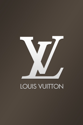
Cole, Louis Vuitton


I chose the Louis Vuitton logo because it grabs my attention every time I see it. For a long time, I thought that it was the combination "XL" with a crazy right leg on the "X". Eventually, I deduced that designer purses having an abbreviated "Extra-Large" logo on the sides of them seemed too absurd. But, it makes it makes the logo more interesting to have that "aha" moment while reading it. The logo has a very professional, high-fashion quality about it, but the fact that the L and V are offset adds a playful touch. Additionally, the stems of the V don't line up at the cap height, and this further develops the playful quality. I really enjoy the artist, Takashi Murakami, who was commissioned to design handbags for Vuitton several years ago. The combination of his iconic imagery with the "LV" logo produces a very eye-catching aesthetic.

Garza - Northwest Airlines


I went with the (now old) logo for Northwest Airlines. The logo is clean and simple and merges the letterforms together to make an "N" and a "W." The logo is also contained within a circle, which makes it similar to a compass layout, and the logo is positioned in the upper right side, or northwest. Sadly, they have redesigned their logo... not for the better.

Sosa-New York Yankees


I chose the New York Yankee's logo because its arguably the most recognizable of the MLB team's logos. It's simple yet stylish by its curving letters and balanced weight. This logo has been around since 1877, and despite its simplicity, its effectiveness has proven that it can stand the test of time.

Martinez-LG


Here is the LG (Life's Good) logo which is an electric company founded in 1958 in Korea. LG makes household electronic appliances, like tv's, refrigerators, washing machines, and telecommunications, etc. I don't know exactly who named it LG but it was first founded under the name "GoldStar" in 58' and merged with another electric company in 95' called "Lucky" which combined became "LG Electronics" "Life's Good" is the current slogan.

I found this logo made for Hartford Whalers that was designed by the company Cummings & Good. I think it's pretty interesting because the negative space in the "W" is used to create the "H". It's a pretty successful design because the H and W are visible and the tale of the whale help connect the logo with the type of company it was made for.

melton-merging


This is the logo for cgi interactive. It was done by roh design.


Ordaz- TUI

I chose this letter merging logo of a travel agency, TUI. It is a world wide travel group whose mission is to "put a smile on peoples faces." I just thought that it was a clever merging of all the letters to create an implied smiley face which is directly related to their mission statement.

Sarah Rice-Tiffany & Company

I chose the Tiffany logo of course because I'm a girl and what girl doesnt love Tiffany's. I think it fits the current assignment very well. It also does a great job of describing the company; very elegant and refined. The typography chosen helps to emphasize that. None of the letters are "combined" in actuality but the layering (overlapping) makes it very clear yet complex. Very well executed in my opinion.

Tuesday, September 14, 2010

Megan James- LA Dodgers


I chose the LA Dodgers team logo. The letters overlap and the bottom part of the L makes the cross section on the A. It is very simple and clean.

Gonzales- ESPN logo


Who knew that the Walt Disney Company owns the Entertainment Sports Programming Network? Just a little random fact for you.

I like ESPN's logo because even though there is a white line crossing the upper portion of the letters, the logo is still legible. The "S" joins the "P" and forms, in my opinion, a solid block floating in space, but when you look at the bottom half you recognize the letters.

ESPN was founded by Bill Rasmussen and first aired on September 7, 1979.

Davis-Cotton logo


I chose the Cotton logo for its simplicity. The way the two t's come together to form a cotton plant is dynamic and rather stylish.

Tyler - Oakley retro logo

This logo is from Oakley sunglasses, the O, A, & K are combined, as well as the L, E, & Y.

whisenhunt - Bike Worx


This is for a bike shop in South Carolina
This is a cool design that uses the first letters to create the logo that works as part of the shop name and works as a stand alone logo too.

This is a nice logo that connects the G and the T. Ive found that sports teams do a lot of this and I think it's very effective in creating a compact text that represents the team well.

Sunday, September 12, 2010

Kopecki- Randy Rogers Band


I like texas country music and the Randy Rogers Band logo has always looked cool to me. The band began here when it was Southwest Texas State if anyone didn't know. The band’s cattle-brand-style double-R logo has facing letters divided by a broken white line symbolizing the never-ending highway of their road-warrior existence. I could not find exactly who designed their logo, but it sounded like it was more their idea. Each memeber of the crew even has a tattoo of it!