Saturday, February 6, 2010

Logo Design: LOCK


I couldn't find the designer for either logo but I thought its still qualified for the blog, because it's simple and brings you to the point in a instant

Random lol


So this has no relevance other than the fact that this is hilarious and this is the only place i can post it and actually think that someone somwhere, out there will laugh.

WELCH expressive type


this expressive type poster was made by Kinnari Thakker to advertise the new artists and designers of 2006 at the Srishti School of Art Design & Technology.

Friday, February 5, 2010

Gesch-Expressive Type


The Recording Academy, Client
Steve Yee, art director
Eric Arnold, writer
Patrick Condo/Bob Rayburn, creative directors
Rob Schwartx, chief creative officer

I found these posters in my latest issue of Communication Arts. I love the fonts, colors, and it really excites me how awesome this looks!

Webber - Bring da Noise, Bring da Funk


I remember when we saw the video in class about the lady who created the Citi Bank logo as well as this poster for a off Broadway dance show. This poster is great because it perfectly conveys the message about show that loud, noisy and fun. The reviews and different sized text make the poster loud and busy. Would be interesting to see text inside a silhouette of a dancer with a oversized text across the background. The white poster is also featured in the Pentagram book.


Karissa Cardoza - Expression

i found these nuggets of goodness on http://f**kyeahtypography.tumblr.com, they typically post some pretty rad type images. Even though some of these aren't really what we are doing in class, i think they are creative solutions to expressing the word/phrase.


Maria -Key


Key, The New York Times Real Estate Magazine cover, 2006.
design firm: The New York Times Magazine; creative director: Janet Froelich; art directors: Dirk Barnett, Arem Duplessis; illustrator: Carin Goldberg; editor: Gerry Marzorati; client: Key Magazine
Illustrator Carin Goldberg was given the 2009 AIGA Medal for this.

Craft

This is Ebon Heath, I could stare at his work all day. I've included the URL to a lot of his other compositions here.

Ann Morris - Expressive Type - Riot

I love this one for this assignment... this is a perfect example of expressive type. This album cover was done by the music industry art director Mark Obriski for Paramore's 2007 album Riot. Paramore is a punk group, that is compared to such groups as No Doubt, having a female lead singer. There influences are groups like Jimmy Eat World and Death Cab for Cutie.

Godwin, Philip Cheaney


This was done by Philip Cheaney; an MFA student and practicing designer at the SVA in New York city. I like the simplicity...all he realy needed was a "growing" g.

Brimer


This is a concert poster for The Strokes created by George Strouzas who resides in Athens.

GARCIA, Concert Poster


Here is a beautiful event poster from Wes Wilson for the Jefferson Airplane/Quicksilver Messenger Service/Lightnin' Hopkins concert from 1966. For this work, he was intrigued with the sensory aspects of concertgoers in San Francisco, and reflected those ideas into a very organic, expressive and psychedelic masterpiece. Rock n' roll.

Thursday, February 4, 2010

Kuehne-United Nations Population Fund: Population day

United Nations Population Fund: Population day

Creative Directors: Ashok Karnik, Siddharth Bindra
Art Director: Priti Chandorkar
Copywriter: Siddharth bindra
Typographer: Priti Chandorkar

UNFPA, the United Nations Population Fund, is an international development agency that promotes the right of every woman, man and child to enjoy a life of health and equal opportunity. UNFPA supports countries in using population data for policies and programmes to reduce poverty and to ensure that every pregnancy is wanted, every birth is safe, every young person is free of HIV/AIDS, and every girl and woman is treated with dignity and respect.


Salas, Expressive Type

Designer: Oscar Wilson. Client: Visit London, the Mayor of London's campaign to entice visitors to some of the capital's most famous areas, events and attractions. The image is composed from multiple lines of hand-drawn copy. The work, commissioned by agency RKCR/Y&R, is currently doing the rounds on buses and tubes throughout the city.

Gaines, expressive, 2pm

this is an expressive type poster for the rape and sexual abuse center made by David Croy

Stacy, Expressive Type

This poster was designed by Michael Bierut and Jennifer Kinon for the Architectural League of New York, when they relocated to broadway. When they relocated, the league staged its fall programs as well as other events all over town. This was one of the posters they used.

Considine


Here are some more examples of expressive type illustrations by Paulo Arraiano shown on www.cpluv.com


Babson, Paula Scher


The artist is Paula Scher and she designed this poster for Noise Funk a theater production.

Englert, Taylor. type makes me vomit

I found this on deviant art. some guy named damaged innocence made it and i thought it was pretty cool/funny. The colors and text are nice and basic and the silhouette makes the image visually interesting. I like typography though. It doesn't make me vomit.

MARTINEZ, Expressive


This is the cover of the CD "So Far Gone."

It was created for the Canadian born artist Drake. At the time of the release, he was not yet signed, however he is now signed with Young Money Entertainment. The cover art was designed by DARKIE and artist from Toranto, and was based on the controversial cover for the ECONOMIST MAGAZINE circa 2007.

Music on this CD include collaborations with artist such as Lil Wayne, Trey Songs, Lloyd, Omarion, and much more!

Pentagram: What Font Are You

take the test

What Font Are You?

OLESEN, Henry Holt Publishers

Design- Roberto de Vicq de Cumptich and Matteo Bologna
Design Studio- Mucca Design
Client Henry Holt Publishers

Boothby, Expressive

http://www.youtube.com/watch?v=N7f3v0h3FNk

This opening credit sequence was designed for Disney by Pixar Studios in 2001, the film was released on November 2, 2001. The typeface emphasizes the creepy yet playful monsters in the movie and the animation shows some letters like the M attacking a monster and then used as his teeth.

Hartfield, Expressive Type

So I thought i was going to have a hard time selecting a piece for this because all of my initial ideas had been posted immediately (Jay Z, Grammy posters etc) but I remembered I own a piece of expressive type. I volunteer for SXSW every year (except for this year, thank you Texas State) and in 2009 the interactive tote bag looked like this:
They have had a few totes and different things around the conference with expressive type but i clearly remembered this one. The designer is Mike Rhode.


Wednesday, February 3, 2010

marasigan - 5dollarwater.com


The whole thing isn't necessarily expressive in the way that our project is, but there are a few times where it is.


(Produced by Angel Mission and Eyegate Media
Co-Directed and Animated by Aaron Garcia
Co-Directed and Designed by Matthew Barr
Illustrated by Bailey Comics
Created in 2009)

Thomas- Expressive Type Deux

I was unable to find out much on this lovely thing except that it was printed in Sweden in 1960, possibly designed by a person named Bergentz.

Thomas - Expressive Type


Designer Jim Sutherland, from Hat-trick Design, designed this typographic deck of cards. He neither repeated a typeface nor altered a typeface, which Sutherland said “made it hard but very rewarding. It was like solving 54 micro design problems."

A link to where I found it here.

Hamm- Evan Roth

Digital artist Evan Roth commissioned to create a music video for Jay-Z's "Brooklyn (Go Hard) for (RED) and The Global Fund to Fight AIDS, tuberculosis and marlaria. Premiered on World AIDS Day, December 1, 2008

Dix

Found this online, it says its by Ork.

Wilson, serial killer


I thought this was pretty neat. This is a commercial production for the Crime and Investigation Network to promote Serial Killer Sunday.
I searched for a date and the designer, but was unable to find it. Hope it inspires you!

Tuesday, February 2, 2010

SIMMONS, Typographic Conundrums


The first fifteen of Harry Pearce's Typographic Conundrums. The treatment of the type in each box reveals a well known phrase, for example, 01 is ‘Eyes on the prize’. Test yourself against all 108 in our full report.

http://pentagram.com/en/new/typographic-conundrums/

Larson-Nike


Nike--Black History Month Ad---Feb. 2008

Perry- Expressive Type

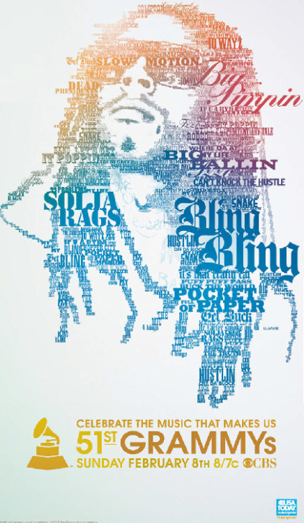
This poster was for a James Brown concert, and the designer Sergio Moctezuma made it out of type. The type in his face are his personality characteristics for instance "The Godfather of soul" and etc. The other words he is supposedly singing about are his lyrics. The poster was done sometime before may 6th, to have it ready to promote the concert, but the year I am not sure of.

Switzer, Heart Made of Sound - Softlights


Made for the band, Softlights, by Kris Moyes.

Belcher, expressive type

I couldn't find who designed this poster but it was designed for the 2009 Grammy awards. The Grammy's top nominees were asked to name their 15 favorite songs from their lifetime. The song titles they chose were used to produce portraits of their faces. Other posters made included Stevie Wonder and Rihanna.

COOK, 27 Dresses


Paula Scher designed this poster for the Henri de Toulouse-Lautrec tribute portfolio. Printed in 2001.


Ignition Print designed the 27 Dresses movie poster in 2008.


Clare, Zombieland


The opening credits from Columbia's Zombieland. (2009)
This movie uses typography throughout the movie, (as rules of survival) and looks really great intergrated with the movie.

Exspressive Type - Neiman Marcus


Jack Stauffacher, who spends most of his time perfecting the craft of printing and designing books meant to be read, has created several portfolios of art prints using huge wooden letters, some of them broken, and the hand techniques of letterpress printing.

Lee - The Prevention Plan


U.S. Preventive Medicine / 2009

EMBREY, Expressive Type


The title was a collaboration with Saul Bass and Alfred Hitchcock. Released August 1960

Brown, Film by Chris Gavin


Created in 2009 by Chris Gavin in association with Tandum Films. X-D

Type Comic

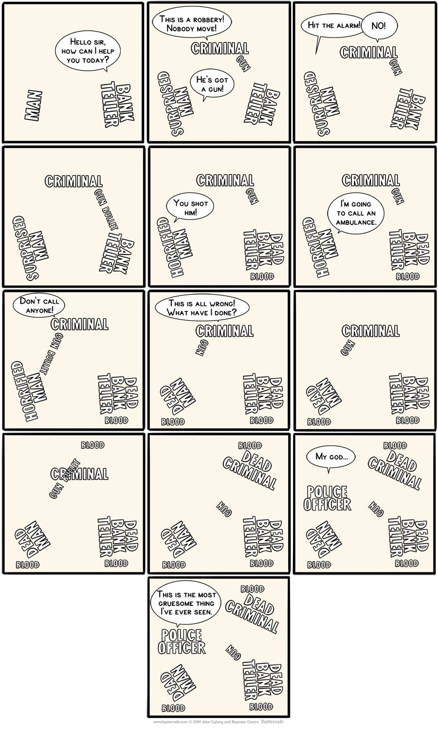
Also, this is a type comic from the web comic Buttersafe (the link leads to a more readable version of the comic)

FELDER, Buchstabenwelt


This poster is called Buchstabenwelt, meaning Letter World in German. Each land form is made out of the letters in its name. This image appeared on a few type blogs, but I haven't been able to find the original designers name. It's also on a lot of merchandise online.

Monday, February 1, 2010

Typolution

I remember watching this a while back & had forgotten about. My ComDes professor (Houser) showed it to the class last semester & I was even more impressed by it the second time around.
If you haven't seen this yet, it's definitely worth a view.

Blog Assignment WEEK #3: Expressive Type

BLOG ASSIGNMENT Week 3:
Post up an image of type being used expressively as we are with our current project (Proj 2 Expressive Type). Posters, Ads, Bookcovers, CDs, etc. If you google search "expressive type" you end up with school projects similar to ours. I do not want those! I would like real samples from real designers.

Included in your post: Client Name/Design Firm (Designer)/Year if possible
Add the labels "expressive" & "class time". Remember to add a comma between the words.

This will take some time to find. It may be best to approach this by physically scanning in an image from a book or magazine you find.

DUE by FRIDAY, February 5th @ 5pm