Saturday, October 3, 2009

Fun CD cover: 'Revisions Revisions'


More about the record: http://www.subpop.com/releases/nobody/full_lengths/revisions_revisions_the_remixes_2000_2005

Friday, October 2, 2009

Designer Interview- Olofsdotter

Linn Olofsdotter is both an interesting graphic designer and illustrator. Both her and her husband have been published in many reputable and international books. More can be read at the interview conducted by "TAXI"


Click here to read more

Thursday, October 1, 2009

Awesome Interview w/ Alan Dye

Designer Interview- Wim Crouwel


In this video of Dutch designer and typographer, Wim Crouwel, he talks of his inspirations for design, how he goes about his design, and he gives a little bit of the history of the typefaces he has created.

Wednesday, September 30, 2009


Monday, September 28, 2009

Higgins_Proj3


My first idea was to show the different bags, backpacks, and cases i use and carry as i go to my different jobs and classes throughout the day

My Second ieda was to show someone doing gymnastics on the highbar as gymnastics club takes up a big part of my day

henken_proj3


The first idea came really natural because it is the one thing I do everyday. I DRAW LINES. The other is my more productive when everything revolves around my iphone, but the alarm screams STUDY!...the least of my priorities. I used helvetica neue in both, switching between the lights, darks, extendeds, and various sizes.

Dollinger_Proj3


This is about a day during my first year lifeguarding when I saved a 4 y/o boy from drowning.

Expressive type

This is a shirt I have that in one font says New Orleans but is then made to say Never Forget.


The weekend before last was a crazy one. It was basically a very anger-driven weekend and just about the entire time, I felt as though I should have been hitting someone and part of the time I felt as though I should have been hitting MYSELF. The boxing glove represents my attitude throughout the weekend.

Bassett Proj3 Roughs


In a nutshell i had a very bad day where my alarm did not go off which made me late to a critique. Then i got a call that my brother broke his leg. On my way to get my brother i was pulled over for speeding. It was a very bad day to be perfectly frank. My first composition is supposed to be a tidal wave just coming through and destroying what was once a normal day. I ended up going with futura font in booth my compositions because i liked the way it looked as a tidal wave. Also in my second composition which is a drain sucking all the bad things that happened away. I used futura in this composition as well because i needed a perfect symmetrical O to make the drain. This composition really appeals to me because at the t=end of that day i took a really long shower which felt great to just wash all the bad things away.

Green, Proj3 Roughs


For both of my roughs, I used the typeface "Myriad". I chose this font because it has a ton of interesting glyphs and also different styles. This will enable me to make many different shapes for the buildings, etc.

My first rough is a representation of a regular day during the week. I live in Austin and drive to San Marcos daily...I feel that I spend an awful lot of time in the car (thus the repetitiveness of the word "drive"). Contained within the buildings are the different activities that I do throughout the day in those places.

For my second rough, I took a totally different approach. I decided to display the different outlets for music that I use throughout the day. Along side are a few artists, playlists or locations where I listen to this music.


Pliego Proj3


Pliego Proj3 Roughs

I decided not to list my entire schedule because on any given day it is very extensive. My days are usually non stop and about 18 hours long, no joke! I work full time, about 50 hours a week and I am taking 6 hours of class on top of that, while still trying to have a somewhat normal social life. Needless to say, the ends justify the means because i am working towards acceptance into the MFA program. I aimed to make a piece that was representative of how my current schedule makes me feel rather than just a list of events. I was really trying to use symbolism.

The design with the spray can has different "layers" in the message. everything from the spray can itself to the way I typed out my schedule on the "wall," it all conveys a specific message.

The second design is more short and to the point. The bird is on a leash, it represents what keeps me focused in my current schedule. Of course, I hold onto the leash that is tied to that catalyst that guides me throughout my hectic day that i sometimes what to escape so that at some point I can reach my goal.


Bundy Proj3 Roughs


A candle represents the short time in my day-to-day which I can relax. Some days are darker than others and that is shown by the color of each candles' background. I don't always have time to relax so when I do, it is intense, just as the text. This typeface has a calm feel about it and is all lowercase because there is nothing relaxing about capital letters. I wanted the candle, the flame, and nothing else; no smoke, no background, just the candle and it's flame. When I relax it's all about me and no other complications in the environment.

Moody proj3 roughs, 11am


The image on the left is just an example of an average day for me. Everything kind of works in a pattern and builds up to my classes and then winds down afterwards.

The image on the right is of my trip to Italy, i chose a wine glass spilling over to show how fantastic everything went and then at the peak of the vacation i got REALLY sick which ended up killing the mood for the rest of the time there untill i came crashing back to reality when i had to fly back to the US.

Goldstein Proj 3 Roughs


With the image of the phone, its about my day when I work at a call center. I spend about five hours on the phone so it takes up a large amount of my day. On the second one its about walking around campus. I don't have a car so I walk pretty much everywhere and to and from my apartment to Mitte at least three times a day. Plus walking to everything else around here it really adds up.

Drake Proj 3 Roughs


For my first rough, I thought about how every day for me is pretty much the same, but once the day is over, I have many things that I can choose to do.


For my second rough, I thought of all of the things I have to do during the day and everything I have to remember to do. I am constantly doing something and rarely have any free time.

Vincent Proj 3 Roughs


My idea for these came from one of my hobbies, rock climbing. It's been my way to relax after a stressful day for many years. I wanted to show how climbing makes you focus on what you are doing at that very moment and nothing else. I also wanted to show how stressful a day can be. These are still in the rough stage but I think they capture the basic idea.

short video of milton glaser


Several Interviews with Chuck Anderson


Interview of Chuck Anderson


Chuck Anderson is an extremely popular free-lance artist with a long client list. In the interview he talks about being a self taught free-lance artist and where he gets his ideas from and what inspires him.

He also did an interview with Retinart
and MocoLoco.

Rhodes Proj 3 Roughs


I wanted to create a how-to guide for my day, sort of a very regimented and systematic way of living. I enjoy making lists and being organized, label makers are my life, I enjoy making grocery lists, my notes are bulleted, numbered, indented......you get the idea. I wanted my composition to reflect that. Although it's not completely finished, you get the idea. I had another idea I was working on for an image based solution for a watch but it was not working well, so this it!

Rudock_project 3 roughs


ALBA PROJ 3 ROUGHS


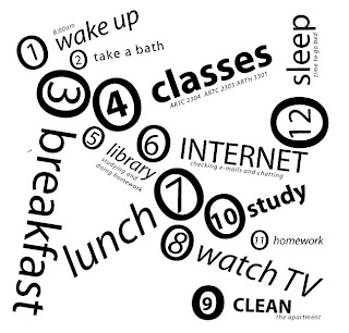
In my first rough i decided to create my daily schedule in a cup shape, because every day i drink coffee. This is a typical day since I'm here in san marcos. I used bodony as a the typeface
because I tryed several fonts and this one I liked the most. My second image is very simple. Each number represents the things i do in order, since i wake up until i go to sleep. I chose myriad as the typeface because is a simple font as well as my composition

Samples Project 3 Roughs


For the first rough I wanted to use humor to portray how I would like my day to be versus how it really is (I'd like to eat eggs and bacon every morning for breakfast, but in reality I usually just eat a pop-tart). I think that's something many people can relate to. I used the Light version of the font to show how I am somewhat ashamed of how my day really is. I used Goudy because I wanted a san-serif font and it had a nice contrast between the bold and the light versions.

For my second rough, I used a more graphic approach (as opposed to textual) to portray a robot short-circuiting. Oftentimes I feel like a robot programmed to go to school, go to work, go to school, go to work etc. At times it can be over-whelming and I feel like my head might just pop off! I used Futura because I felt like it went nicely with the robot theme.

Chavez Proj 3 Roughs

The story I chose was when I was young and had a nightmare after I watched a scary movie.
It was traumatic and I remember it vividly so I decided to compose my piece accordingly. I chose Helvetica to give a strong rigid effect. The feeling needs to be dream like and lots of movement. The difference between the two is that the first is not as fluid. The part I'm stuck is where the letters float up and come down, it's not as cohesive as I'd like.
For my first second rough I chose Baskerville with a serif to add some edge and mood to the image. The feeling needs to come across as raw and unrefined yet dream like. I want it to be surreal with a lack of time and a split composition. The difference between the first and second rough is the first is more intense with more detail to direct the viewers attention from the bottom left to the top left briefly stopping at the bed which is the combining factor.


Speer_Proj3 Roughs


Both of these are just an average school day. I choose Futura because I like the simple and clean look it has. I didn't have a plan so much just wanted a clean or interesting design and not a "theme". The 24 just stands for 24 hours in a day, maybe thats a "theme"? Not sure if I'm stuck on anything but any ideas to improve or just change them would be great. Or if I should make a "theme" one :/

Allen project3 roughs


The first one is about how my days end the same way they begin with sleep and dreams and then just kind of tumble back to that over and over, the second one is coffee-centric and shows how my day goes before and after coffee through the size and weight of the text.

Corey Pro3 roughs


So, I was on my way to school the other day and got soaked; so I decided to base my project
on that. The rain is supposed to be the mundane, and the negative thoughts through out the boring day. The feeling is that you see a bunch of type that is overwhelming and relatively homogeneous, yet there I am in the midst of it.I picked Futura type because, it's simple which is perfect for the rain yet playfully modern which is good for the figure and umbrella. In the first image I stay happy under my umbrella in my own little world despite the horrible day and in the second image I can't seem to escape bad things from happening although the world around me seems to be carrying on just fine. The second image isn't as developed because, I don't really see myself as so negative; all the contrary.

Chavez Proj 3 Roughs

The story I chose was when I was young and had a nightmare after I watched a scary movie.
It was traumatic and I remember it vividly so I decided to compose my piece accordingly. I chose Helvetica to give a strong rigid effect. The feeling needs to be dream like and lots of movement. The difference between the two is that the first is not as fluid. The part I'm stuck is where the letters float up and come down, it's not as cohesive as I'd like.


For my first second rough I chose Baskerville with a serif to add some edge and mood to the image. The feeling needs to come across as raw and unrefined yet dream like. I want it to be surreal with a lack of time and a split composition. The difference between the first and second rough is the first is more intense with more detail to direct the viewers attention from the bottom left to the top left briefly stopping at the bed which is the combining factor.


Rodriguez_Project 3 Roughs


So for my first rough, I usually start my mornings off by reviewing a list of things in my mind that I need to do for that day. Basically anything with school, those are my priorities. I'm always on a rushed schedule... So through out my day I block out distractions that sometimes can interfere basically anywhere I go, such as my phone and internet, even day dreaming. You can also see in the image when that the figure is pushing down distractions. The feeling conveyed in this image should be of a rushed and busy day, stressful, and untop of things.
For the 2nd, It's the same Idea, the message is obvious because my day is an hour glass. Like I had said above I'm on a rushed schedule. Priorities are at top of my day, and distractions at the bottom of my day.

Heckendorn Proj 3


I'm getting married in December so now I live and breath wedding details until then. It adds great stress to an already over stressed load of work and school. The first one is a list of decisions I have to make, lined up like a cake. The bride and groom are blissfully happy when the day finally arrives, taking their place on top. The second is dealing with stress again, a giant mouth being fed wedding cake and liking it. I outlined the face in stress, fun, love; the vicious cycle I endure everyday. I'm very happy to be getting married, but Vegas is looking pretty good at this point. I don't have a particular reason for choosing the type, the first is in Myriad and the second is Gill Sans. I found them both equally reasonable to work with and make designs. I like the concept of my images but I'm just wondering if more is needed.

Sambola Proj3 Roughs

My first rough is a typical morning for me. My alarm literally goes off every 10 minutes until I wake up, late. The increase in size reflects the increasing annoyance of the noise. The small comments are my thoughts throughout the morning and of course the expletive when I realize I'm going to be late for class.

My second rough is what starts out as a very organized, boring day filled with unimportant things. Once work started my day kind of went downhill fast. So things got thrown off starting with drama at the desk then a day-wrecking phone call, hence the titling of things.


kallus project 3


So my days are never the same so for the first i did a lava lamp with the things that constantly change. the second is the 2 constants in my day waking up and going to bed. everything else just happens