Thursday, March 4, 2010

WELCH proj. 3 daily schedule


on my first rough, i talked more about a typical school day for me. i feel like this one needs A LOT more work done to it. i would appreciate any pointers you have to make it look better. i wake up late all the time, no matter how man alarms i set. i also stay up late, and usually its not because im doing something productive. this makes me run behind in everything. sometimes i feel like everything is just going to fall apart. i wanted to make my daily story look like a stack of jenga pieces falling over from my sleep late "ball" knocking it over. i chose futura as my typeface because i liked the amount of options i had to change the look of the font. i also just felt the sans serif looked better for what i was trying to get across.

on my second rough, i wanted to show my days at work through an image. my work days are redundant, and i serve so much alcohol, more than anything though, guinness. i work at an irish pub so it's kind of required. everyone that hangs out there have become my friends. when i think about it though, we have become friends because they are there ALL THE TIME. my friends are alcoholics. thus, my pint of guinness created with multiple sentences such as "i serve beer to alcoholics." i chose the garamond typeface because it reminds me of the typeface they use on guinness glasses. while i feel like this piece needs more work, i am overall happy with what i have so far.


Daily schedule, rough Chris Berry


Both daily schedules are centered around my job, the first schedule is my Wednesday mornings at Starbucks. The schedule itself loops around the coffee cups, and cup is constructed out of a description from drinks i sell the most. The second is my Saturdays at my second job Underground Games, its pretty straight forward, illustrated the schedule like it where a street fighter command list.

Belcher Proj3 roughs

I wanted to portray a tornado effect destroying things that I need to get done. The words in the tornado are things that take up my time or affect things that I would like to get done and the words being torn through are the words that I need to get done. I don't know if there is enough difference between the tornado and the other words. I would also like to know thoughts about the different sizes of swirls in the tornado or any ideas about the other small words.

Godwin, Project 3 Roughs


Both of my roughs are about a day I had just about a year ago...
I was working as a content manager for AMD's website. I had decided to go back to school to get a Bachelors degree after getting my associates in 2008. I made an appointment the following day to see an advisor and I needed to update my portfolio. I went to my office and was overwhelmed with migrating 10yrs of press releases before the new site launched. After Thursday morning meetings my team and I went to lunch. After Lunch I decided to work from home the rest of the day to get a head start on my portfolio assembly. By about 10:30 p.m. I realized I needed ink and as much as I Hate Walmart…it was my only option as my portfolio had to be ready by morning (always check your ink levels). In the Walmart checkout I started feeling tingly and then sort of light headed so I sat down on the Walmart bench for a minute. I felt fine and began to stand. Immediately I felt really light headed again and I sat back down and felt fine when I stood I instantly felt light headed…this continued a couple more times. I called my roommate to come up there; something was wrong for sure. After about five minutes of waiting on him I decide I was fine and probably just ne three eded food, I would try to at least walk to my car. I stood up and walked about the length of registers before all the sudden I couldn’t feel my feet. Another step and, then I couldn’t feel my calves, and then I could barely see as I started falling. The last thing I saw was my hand grabbing for the cart as a lady’s voice faded away. I wake up to EMS telling me my heart rate is 60/20 and they are taking me to the emergency room. I said, “I don’t have insurance, I want to refuse treatment” but I couldn’t stay conscience long enough to sign any refusal forms. The rest of my day was in the ambulance; just flashes of conciseness in which I repeated, “I want to refuse treatment”. I walked away without a finished portfolio, an undiagnosed medical problem, and a 2000-dollar medical bill. Personally I think it was Walmart that almost did me in!

West_Proj. 3 Roughs


One composition is me trying to recreate a duck and the second one is me trying to create feathers floating down to the ground. (Showing the aftermath of what had happened) The story is that my mother was attacked by my pet duck and ran screaming around the back yard being chased by this duck. Then she retaliated with a broom and this time it was the duck "Quacking" around the back yard while she chased it. I used Bembo I thought it offered a lot of different ways of using it's font. I am very much stuck on the creating feathers bit. I'm really not sure what or how to create the feather look but I'm trying.

Wednesday, March 3, 2010

Hamm, Roughs


I went to Dubai over Thanksgiving break to visit my mom, because she works for Aim Group a travel agency that subcontracts with Flur and KBR. My experience was life changing, I was a minority and my bias judgments about the Muslim, Arabic, Islamic cultures are now gone, since I explored this new world. GO visit this country!

My days are always filled with studying, running, organizations, etc. I never sleep, but I will sleep when I am dead. I always stressed, fear of what is after college, and expectancy from my family and myself. I have friends and relationships that I worry about but in the end I want to put myself first and get my education!

Simmons, project 3 roughs


the first one is what i literally do everyday. except on weekends. wake up, eat w/e, design (class, roughs, anything school related) and then go to sleep. i added exercise and playing guitar because that is what i love doing in my spare time. i wanted to show these words somewhere because they are both hard to fit in in my hectic schedule.

the rough below is a more specific day. i dont like the lines below the text. the main point was to work with the comma's. the spacing determines the amount of time that stuff takes. i am still trying out ideas to make the text and bold commas make sense in the composition. i want the commas to be seen with the text. not just the commas, then the text.

Kuehne, Roughs


The first one is going to be about the orchid trees I grew up with. This rough is pretty jumbled up at the moment because I ran out of time to make it any better. It's also just filled with filler text at the moment too.

This second one is about our recent snow day and enjoying some hot chocolate.

WEBBER- ROUGHS


I'm very involved in student media on campus (tv, radio) and video intern at the athletic dept. it seems like it has taken over my life because i'm always busy with something. The roughs are of me being bombarded, sometimes confused,with camera shots, tv scripts, and stress from a producer or my boss. student media is a lot of fun but it is also time consuming and stressful. the dialogue is distorting, crowded and in different sizes gathering around my head and suffocating me with all sorts of instructions and demands. i used gill sans because it flows with the content and the bolder fonts kinda have a show biz feel to it.

Hartfield Proj 3 roughs

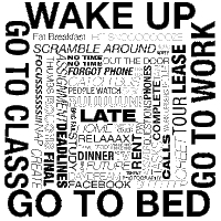
This is my first rough. I decided to use my schedule monday-thursday. I do four things everyday and thats wake up, go to class, go to work and go to bed. I used those to frame different things that happen on different days depending on my schedule. I used Helvetica because of the amount of options. As far as the composition goes I consider my organization style as organized chaos. Nothing is really in a rigid place and I group things together in certain ways. However at the same time I'm a bit OCD (strange combo I know) so I felt like there had to be some sort of structure because mostly my days have a basic frame (the 4 bolded events) and then a bit of chaos inside (the different sizes, strokes etc for the various events). This is my favorite.


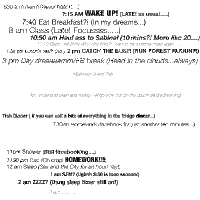
This is my second rough. I basically wrote down everything I wanted to do first then I included either my thoughts on that task or what really happens. As I mentioned before I have "organized chaos". I grouped all the campus events at the top and the late night events I tried to keep them closer to mimic how after 11, everything rolls by quickly vs the afternoon with all the space. I used Helvetica because it had more options to choose from however I finished this on my home comp and I didn't have all options so I plan to switch up sizes and selections at the lab. I'm having trouble trying to figure out how to place everything inside the square so any help would be REALLY appreciated!


I can't remember what else I need to talk about sooo I'll leave it at this. :)

[ Carolino ] Proj 3 - Roughs

I'm not finished with this yet, but because I need something to show before midnight, I'll put up what I have so far. The lines on the shoe are taking longer than anticipated... (Click image for detail)

The story behind this one is pretty simple: School is currently overwhelming me. I just feel like things just seem to continuously pile on my shoulders. The font I chose to use was Gill Sans simply because I like the appearance of the font. The difference between this rough and my other one is that this one is using text to create a visual, while the other is neat and organized.

This idea is pretty simple as well. Through font sizes, I'm graphically showing my energy levels throughout a typical school day. I chose Helvetica because of the clean-ness. I really like the idea, but visually, it isn't the most compelling image.

I'm open for suggestions if anyone has any :]

Larson, Proj. 3 Roughs


My idea in depicting a single day of my life is part of the fact that is is one of many other days that ultimately is part of a "bigger picture". So, hopefully you can tell that I'm magnifying a certain day within the big picture. I chose Futura for the font not for a particular reason other than it allows me to fit "picture" in the 8X8 box. I have also thought about doing the same idea with the word "LIFE". Another idea I had was to have a puzzle peiece coming off of the big word as if each day makes up a bigger whole (like a puzzle). Finally, the R is not supposed to be blank...I don't know what happened there, but it gave me another idea to maybe leave some of the last letters blank as if there were days still left to be written in the future.

Craft_Project 3 Roughs


For this rough, I chose to illustrate the first time I got to ride on an airplane to Las Vegas. I've always loved airplanes so this was a very exciting day for me. I'm still working on what feelings I want to portray so this one is still very much a work in progress.


This rough is of a day where I had woken up late and thought I was late for work, but when I got to work my manager told me that I wasn't even supposed to be there. I'm trying to portray my initial sleep, then frantic fumbling around to get read and get to work, then my extreme frustration after realizing my mistake. I chose Helvetica because I like it..

Belcher Proj 3 Roughs

I wanted to show the beginning and end of the day at either end of the square. I wanted everything that happens in my day to be crammed between the two words awake and sleep. I chose to do awake in bodoni bold because it shows the abrupt wake up call of my alarm. I chose to do sleep in italic because it emphasizes the winding down of my day. I don't know whether to put awake and asleep because awake and sleep have the same number of letters. I also wanted the words to be pushed to the right side how they are on the left but I'm unsure of how to do that. I don't know whether the small words in the middle should be in italic or whether you should be able to see the space between each phrase.

I can't get the second rough to add to this post.

Brown, Proj3 Roughs


I went two entirely separate ways on my concepts. The second is trying to convey a sense of peace and give a pictorial of a hammock between two trees, an ideal of a day, at this point anyway. The first is another fictional day, one where I hit my snooze and go back to sleep, for like the whole day:) I choose the font face on the second because of the stylized characters in the glyphs. I wanted to use the characters to create and actual pictorial. I used the typeface in the first because of it's ridged, bold nature. I wanted to convey the standardness of an alarm, and the monotone, boring, almost hatred of an alarm, and the reality of waking up. I also liked the repetition of the "z"s and how it gives a soothing flatline, like in the space in between, I fall back asleep.

Morris Proj3 Roughs


My day starts out as an average day of problem solving for me (my usual Saturday) and ends with my reward, and the highlight of my day which was going to see Cirque du Soleil's performance of Allegria. I wanted to convey the contrast between my normal day full of crap to do with my fun evening. I had a different layout than this one, but it was shot down. I believe that the other better exemplifies what MY day was like, but without room for artistic interpretation and staying within certain parameters...

The font that I chose was Goudy Old Style, which my computer at home doesn't have, so when I saved it, it saved as Myriad. I had another layout that I lost completely when I was working on it and my computer froze. You can image my frustration I'm sure. So to meet this deadline there are two slightly different versions of the same one...bad night...

Switzer, Proj 3 Roughs


The feeling of being completely dumbfounded is what I'm trying to convey in the above, and below I'm trying to convey the feeling of excitement. I selected the sans-serif font because it seems to have more impact. The differences kind of go without saying, mainly, one was a good experience, one was bad.

Englert, Taylor Proj 3 Roughs


So my first idea is the basic of the basics. its still very rough but i love the idea. It's how it is every week here. lame weeks and awesome weekends. I'm not too sure what to add to it though.

My second idea is basically what i do everyday. the things that make me happy or keep me focused pretty much, and having that being interrupted by going to work in the middle of the day. it sucks, hence the bottles before bed. i have more ideas for this but this is what i put on paper for now.

James, project 3 all parts

This piece describes a crazy day while on vacation to Florida. In one day me and my friends nearly killed ourselves from the amount of fast-food we ate, while driving from one side of Florida to the other and back again in a single day. We also took part in some crazy bowling, and naturally had a to buy some dumb looking socks for the occasion. We all made it out alright, a bit sick from the terrible choice in road snacks, but a good experience none the less!


Part two of the same story, except from the viewpoint of one of the infamous chicken sandwiches! I used franklin gothic for both and one was meant to be kinda crazy and outta control (the first one) while the other was meant to a bit more straight forward.

Thomas, Project 3 Roughs


I get a lot of ideas while listening to my record player. This idea hit me while, yes, listening to it (David Bowie, to be exact!) So, I laid my daily schedule out as a record. On a record, you can tell a new song begins by the thicker lines. The time of day is therefore signified by a thicker typeface (here, Future Condensed Ultra Black). Short copy of my day is set in Future Condensed Bold. A sturdy typeface for readability. I'm a little concerned about the shape all the lines make as they make their way around the circle.


I am an indecisive person. To showcase this, here is a blank ledger with everything I could have/should have/wanted to do has fallen to the bottom of the space, all crumbled and in a pile. I'm not sure if I like how "I can't decide what to do today" is laid out. Also, I wasn't sure as to what times I should show in the ledger; I figured only the main part of the day would do (if I used more, I thought it would take up too much space). Again, I used Futura, for the sake of readability for the crumbled text at the bottom.

Serrano-Mendoza, Project 3 Roughs


I decided to make my rough around the schedule I had while I was studying abroad in Japan. Using the trains and public transportation was a huge part of my experience, so I have font make up a train and the letters space out towards the end to add movement. I used Gills sans because it's very fun. I'm actually not sure how the font is working within the "body". I'm hoping it doesn't seem too smashed in.


I've had to wear glasses since the 3rd grade. Putting on my glasses has been such an integral part of my life. This schedule includes when I first wake up and everything is blurry and hard to see. Once I put on my glasses, everything comes into focus and organized. I used the entire repertoire of fonts. I want to make sure everything is still legible but gets the point of how I feel without my glasses across.

Cardoza, Project 3 Ruffs


for this project, i chose to do it from the perspective of my cat, esteban. the randomness of his daily "activities" are contained within a thought bubble, illustrating that the day in the life of a cat is not structured, but rather spontaneous. most of the activities are animated or stylized to put emphasis on the moment or the individual task, and not the cat's day as a whole....because i'm sure a cat doesn't have a defined beginning and end to his "daily schedule".

I chose the helvetica font family, mostly for its diversity, but used the rounded face in particular for its playfulness. i wanted to convey a somewhat cartoony aesthetic with this project, because i chose a goofy-ass subject.

ps. this is very rough as i am now realizing because you can see some guetto-looking live outlines in the format i saved it in.

Cook, Projects 3 Roughs

In my first rough I used futura. I felt like it was a clean, modern font that would portray a sophisticated feel to my concept. This daily schedule is a trip that I am in the process of planning to California. The top is just a normal day getting ready and daily routine. As the day progress's on we site see and have a nice dinner. At the end of the night we are planning on going out to clubs, dancing and having drinks so I tried to portray a little hazy, confused feeling at the bottom.

In my second rough I used univers. I liked the family of this typeface. I chose it because it had such diverse styles within the family. The concept for this day was a Sunday after a night of heavy drinking, having no dreams and waking up to a hangover.
The first one is a full, chaotic day and the second is a simpler day.

Garcia, Proj 3 ROUGHS


For this project, I decided to describe two different periods in my life. The first, a turntable, comes from my days as a professional dj and all the things that would make up a typical day before hitting the clubs. I chose to use the Univers type family due to its assorted weights, which helped to emphasize strain and stress in different parts of the schedule.

The second was from my first days working as a graphic designer and production artist. I wanted to create a visual of life, organized and in order, only to have the ball or "bomb" dropped unexpectedly on everything. I chose to use the Bodoni family for its clean and relaxed feel.

These designs reflect how my life has seen its share of hectic schedules and unfortunate incidents, the first reflecting a more festive time in my younger life while the latter describes the hardships of adulthood. The only hurdle I have experienced so far is illustrating the sense of motion in the second design. Any feedback would be greatly appreciated.

Babson Proj 3 Roughs


The composition a brief day in my life. I combined elements of running a race with things I do in my daily life. The typeface is Bookman old style and i chose it because I liked how it looked with the BANG!


This composition is about a snow day. It includes all the events, clothes, and things you can do on a snow day. I am trying to convey memories of my childhood. So happiness and the fun that I had on snow days. I wanted the type to be bold, slightly whimsical, and still neat all at the same time.

This difference between the two compositions is that the first one is of my day to day life whereas the second one is specific to snow days. Then the first one is not confined to a shape but flows from top, right to bottom, left. The second one is confined within the shape of a snow angel. The words are scattered because on a snow day it is hectic and as a kid you want to get in everything you can do in that one day.

King, Proj 3 Roughs


For the first idea I was focusing on how the burden of life can be really oppressive at times. I made a list of all the thoughts, moods, feelings, tasks, responsibilities, that I dealt with in one day. It was a huge list. I made the words into the shape of the world crushing down on me. When I started to work on this in school I used Times Roman...I think... but tonight when I brought it home my computer changed some of the font because I don't have that Times Roman on my computer. So I had to upload this crappy version for you. Sorry. I am fully aware I have two different fonts going on here and I will change it when I get back to the school's computer.


For the second idea I am using the Bodoni regular font. The idea is that the three circles in the middle of the larger circle represent my children. Donovan, Angelina, and Nina. Donovan is the oldest so he is the biggest circle and it goes down from there. Myself, Sarah, am the large circle enclosing the smaller circles. I guess you could say that I am protecting and nurturing my children. At the same time I have literal chaos going on around me with the stress of everyday life and the burdens of being a single mom. This represents how I am trying on a daily basis to do the right thing and bring up my children in a happy home while dealing with uncertainty, doubt, and challenges.
I would also like to add that I plan on condensing the words around the large circle....you know, making them really thick, like they are swarming around the center to give a threatening feeling.