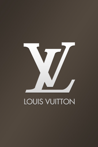
I chose the Louis Vuitton logo because it grabs my attention every time I see it. For a long time, I thought that it was the combination "XL" with a crazy right leg on the "X". Eventually, I deduced that designer purses having an abbreviated "Extra-Large" logo on the sides of them seemed too absurd. But, it makes it makes the logo more interesting to have that "aha" moment while reading it. The logo has a very professional, high-fashion quality about it, but the fact that the L and V are offset adds a playful touch. Additionally, the stems of the V don't line up at the cap height, and this further develops the playful quality. I really enjoy the artist, Takashi Murakami, who was commissioned to design handbags for Vuitton several years ago. The combination of his iconic imagery with the "LV" logo produces a very eye-catching aesthetic.
No comments:
Post a Comment
Note: Only a member of this blog may post a comment.