
 In my first rough i decided to create my daily schedule in a cup shape, because every day i drink coffee. This is a typical day since I'm here in san marcos. I used bodony as a the typeface
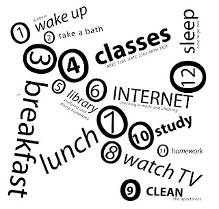
because I tryed several fonts and this one I liked the most. My second image is very simple. Each number represents the things i do in order, since i wake up until i go to sleep. I chose myriad as the typeface because is a simple font as well as my composition
Sara Alba critique:
ReplyDeleteThe concept and image of the cup of coffee I believe is working more effectively than your second rough. When I saw the image I definitely knew right away what the image was and I would have probably suggested you drank coffee most often. The heat waves are working very well and the type used I believe is working great. The serif type emphasizes the classy tradition of drinking coffee. The only thing that grabs my attention is that I probably want the bolder type more at the bottom or more in the handle. As far as your second rough it does not grab my attention as much as the coffee one. Mainly because its too simple and cliché. Although, the type choice is also relevant to the style it is more laid back and casual. I would like to more emphasize on the circled letters carrying your eye through out the layout, but I would rather you go with the coffee it’s great.
Coffee Cup-
ReplyDeleteMy first thought is, nicely rendered. I could tell it was a coffee cup. Bodony works well as your typeface. I want to see your cup more centered in the composition. I’m not necessarily a fan of the centered composition, but in this case I really feel like it is too heavy on the right side. Centered and scaled down seems to suit better in this situation. For the steam coming out of the cup, I want to see it rendered more randomly, as far as shape goes. And remember groupings work better in odd’s not event. Instead of four use three threads of steam.
List-
I like the originality of this composition. Your choice of type works nicely. It is clean and contemporary just as your composition. Even though you do have a variation in font sizes, it still reads really flat. What ever the settings are for the word ’classes’ consider using it on other works in the composition to really add some dimension and make your piece more dynamic. Nice Job.